Design GuidePrint · Identity
Visiting Card Design Specifications
Font sizes, icon sizes, margins, bleed and spacing for a print-ready 3.5" × 2" business card.
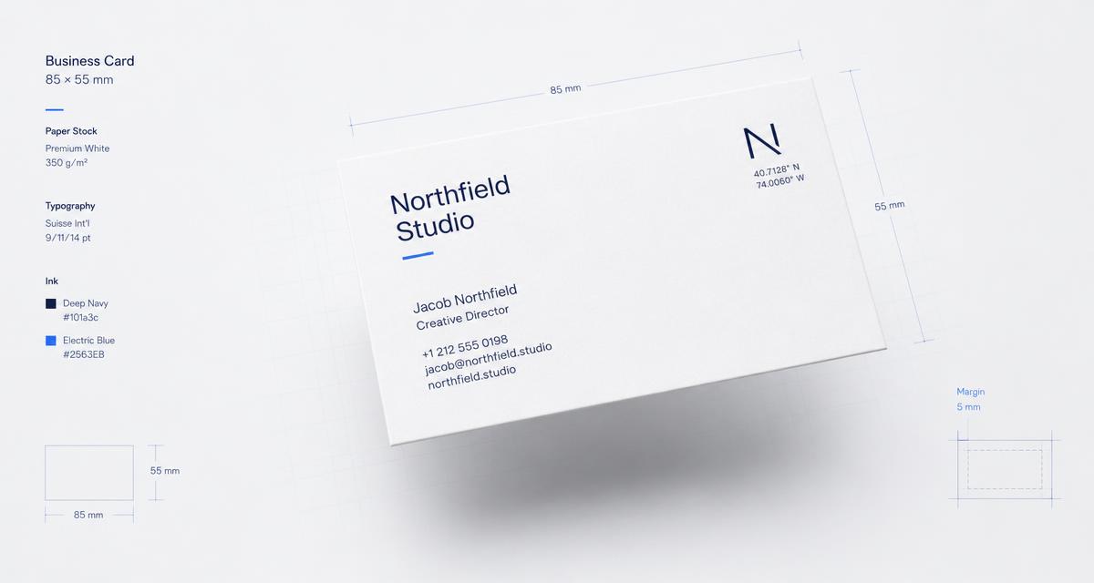
01
Font Sizes
| Element | Size |
|---|---|
| Name (primary) | 10 – 14 pt |
| Job title / designation | 7 – 9 pt |
| Company name | 8 – 12 pt |
| Contact details (phone, email, address) | 6 – 8 pt |
| Tagline / slogan | 6 – 7 pt |
- Never go below 6 pt — becomes unreadable and hard to print.
- Keep at least a 2 pt difference between hierarchy levels.
- Sans-serif (Helvetica, Futura, Montserrat, Proxima Nova) reads better at small sizes.
02
Icon Sizes
Contact icons (phone, email, location, web)
8–12 pt / 3–5 mm
Icon → text gap
2–3 mm
Logo / brand mark
10–20 mm
Vertical alignment
Center to text line
03
Margins & Bleed
| Margin type | Size (inches) |
|---|---|
| Safe margin (edge to text/logo) | 0.12 – 0.20 in |
| Bleed area (beyond trim edge) | 0.08 – 0.12 in |
| Trim line to safe zone | 0.12 in minimum |
Don't let text or logos touch the trim — always respect the safe zone, even if the background color extends fully to the bleed edge.
04
Spacing & Gaps
Name → Job title0.04 – 0.08 in
Job title → Company name0.08 – 0.12 in
Company → Contact block0.12 – 0.20 in
Between contact lines0.06 – 0.10 in
Icon → adjacent text0.08 – 0.12 in
Logo → nearest element0.16 – 0.24 in
Left → right column0.20 – 0.32 in
Quick reference
- Safe margin: 1/8 – 3/16 in
- Small gaps: 1/16 – 1/8 in
- Section breaks: 1/8 – 1/4 in
- Logo / columns: 1/4 – 1/3 in
Line spacing (leading)
Body & contact text: 120–140% of font size. For example a 7 pt font uses a 9–10 pt line height.
General rule
Keep gap multiples consistent (e.g. steps of 1 mm / 0.04 in) across the card. Consistent rhythm reads as intentional design; arbitrary spacing reads as amateur.